Exploration and Iteration

Sketches were mostly done on paper, many different UI interactions were explored including a change vehicle menu for quickly configuring the comparison.
The new compare tool would be responsive and the wireframes featured multiple breakpoints. I proposed fixing the headers at the top of the browser window as the user scrolled down, similar to how the headers in the iOS contacts app animate as the list is scrolled. I created a simple HTML prototype to demonstrate how the headers would behave.


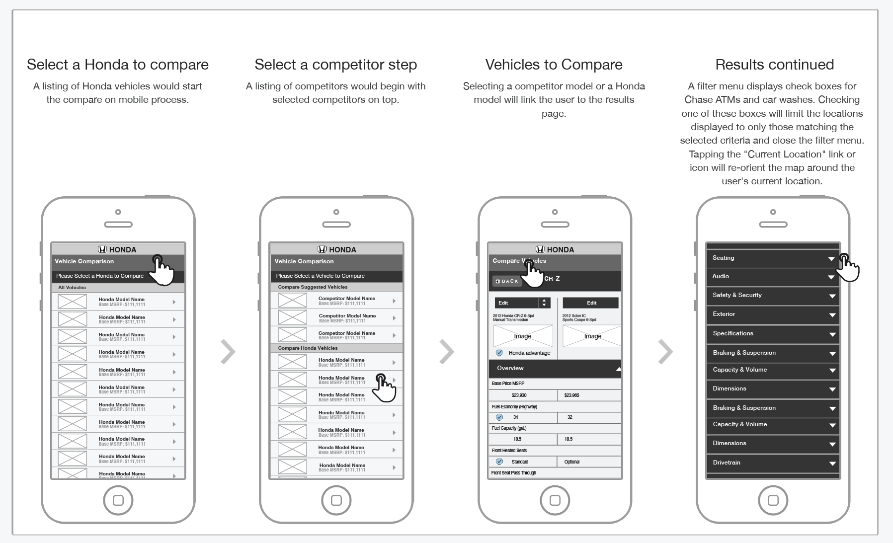
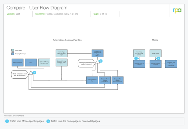
I created a click-through prototype of the whole compare process to show how users will either be shown results immediately or choose a vehicle depending on their context.
Wireframes

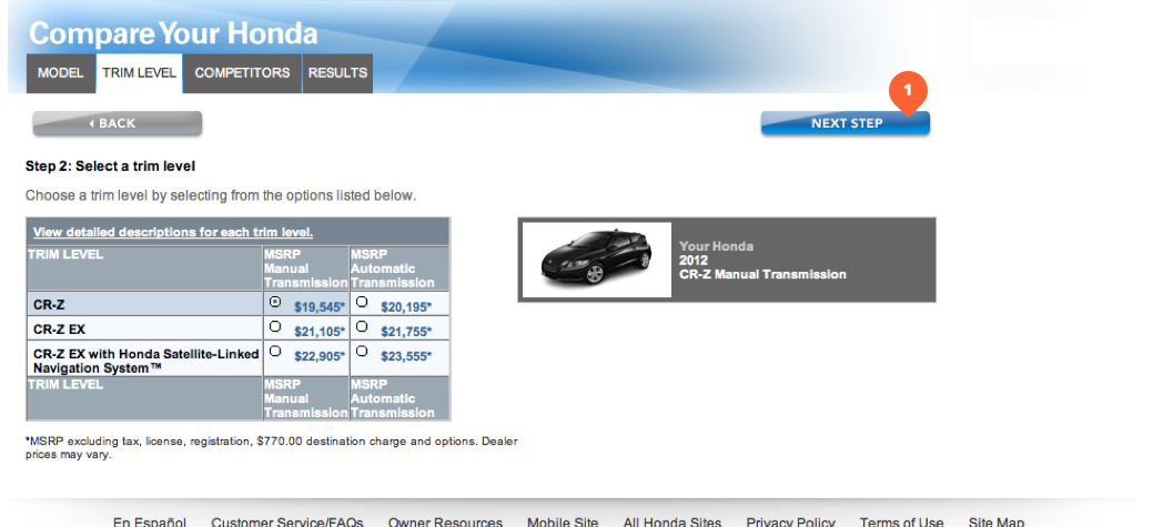
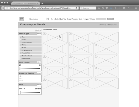
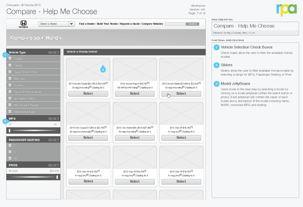
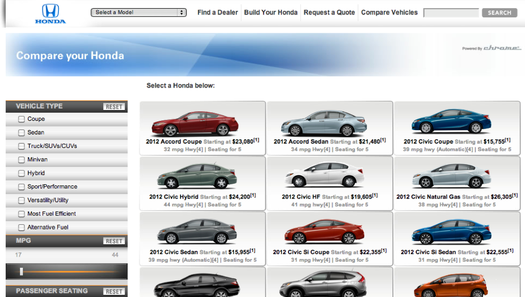
I added filters to the vehicle selection step.
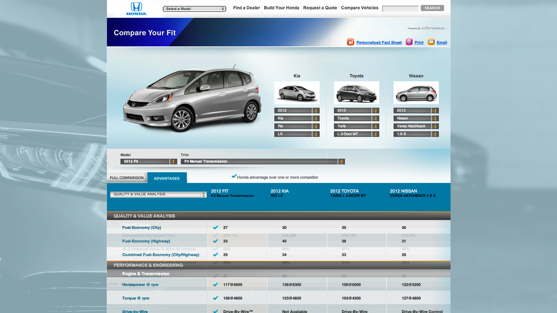
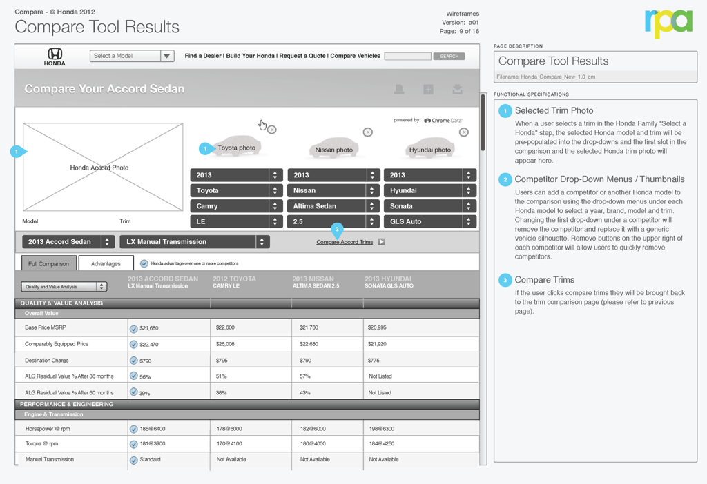
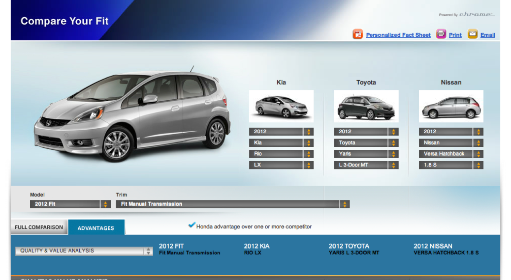
I added larger photos of the Honda model. We also included space for three competitive models and added a scrolling table with sticky headers to detail the results.

Exploration & Iteration
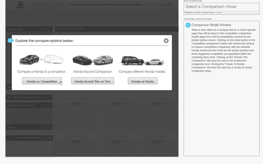
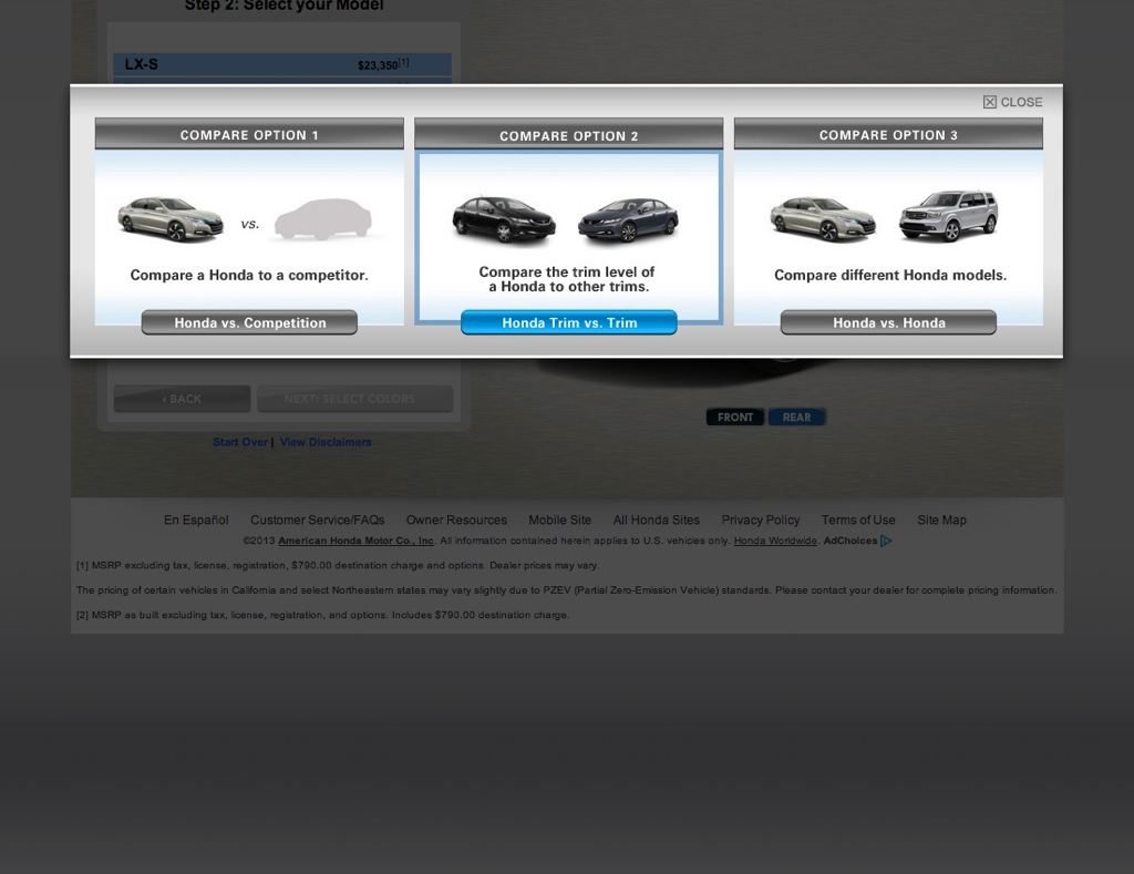
While inelegant, a modal window on model pages allows the user to choose between the two different compare use-cases to go directly to results.

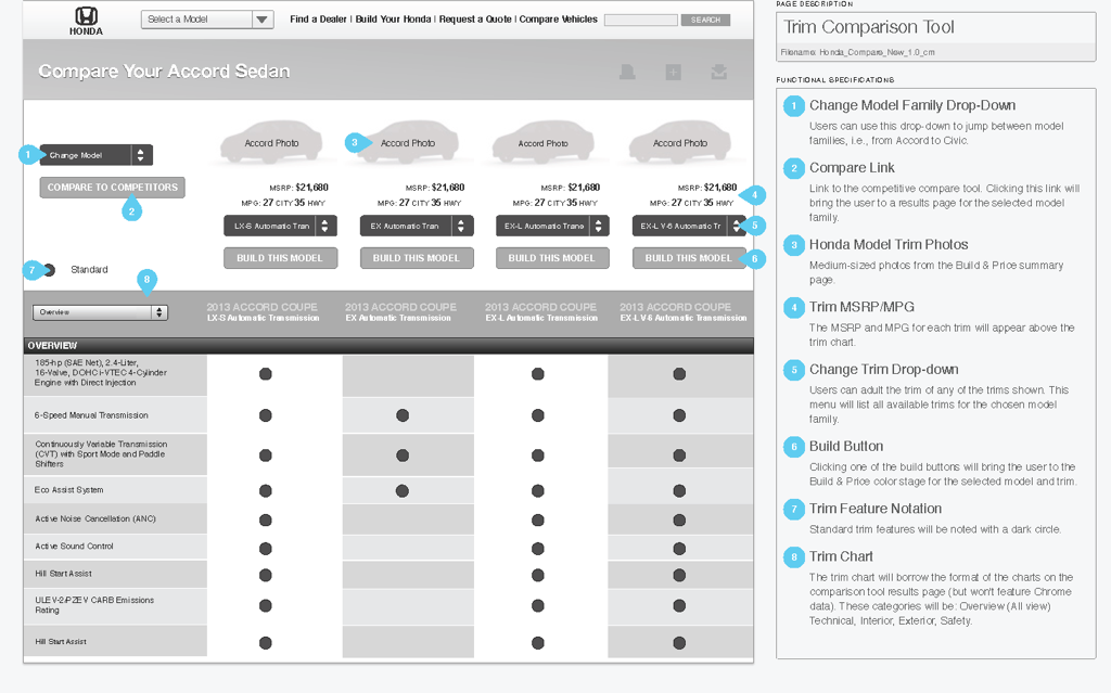
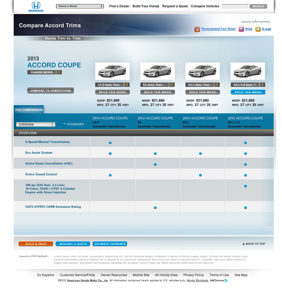
We added a trim comparison screen to the compare tool accessible from the modal displayed when the user clicks compare on model pages.
