Honda Comparison Tool Case Study
Redesigning the comparison tool
My role
- Design research
- UX design
- Prototypes
Team
- Pramit Nairi, Design
- Chuck McQuilkin, Design
- Quinn Fu, Design
- Bradley Stone, Developer
The comparison tool and other shopping tools are important components of American Honda’s automobile website.
The compare tool provided detailed product information in a format that allowed shoppers to compare what matters most to them across the Honda model they are considering and similar competitive models. On this project I worked on:
- Competitive audit of other OEM compare tools
- Content audit of existing compare tool
- Wireframes and prototypes
THE PROBLEM
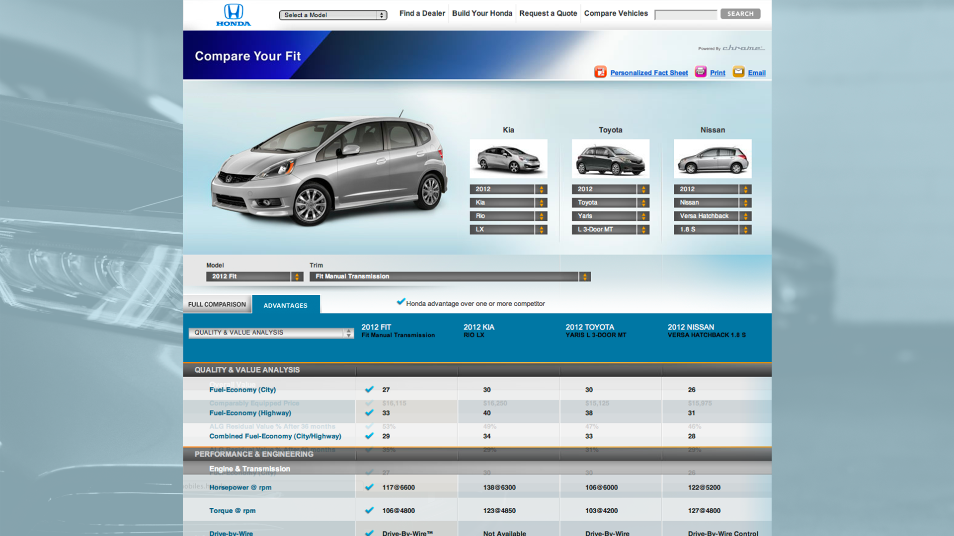
The existing comparison tool was outdated and it prominently featured characteristics about the vehicles that were unlikely to be top evaluative criteria, for example, intermittent windshield wipers. It also had verbose specification headers that were harder read and compare.
The redesign goal was to improve the comparison tool completion rate because analytics indicated significant drop-off on the second step in the existing multi-step comparison process. The team designed, measured analytic KPIs, then iterated again. Analytic KPIs validated the redesign.
RESEARCH
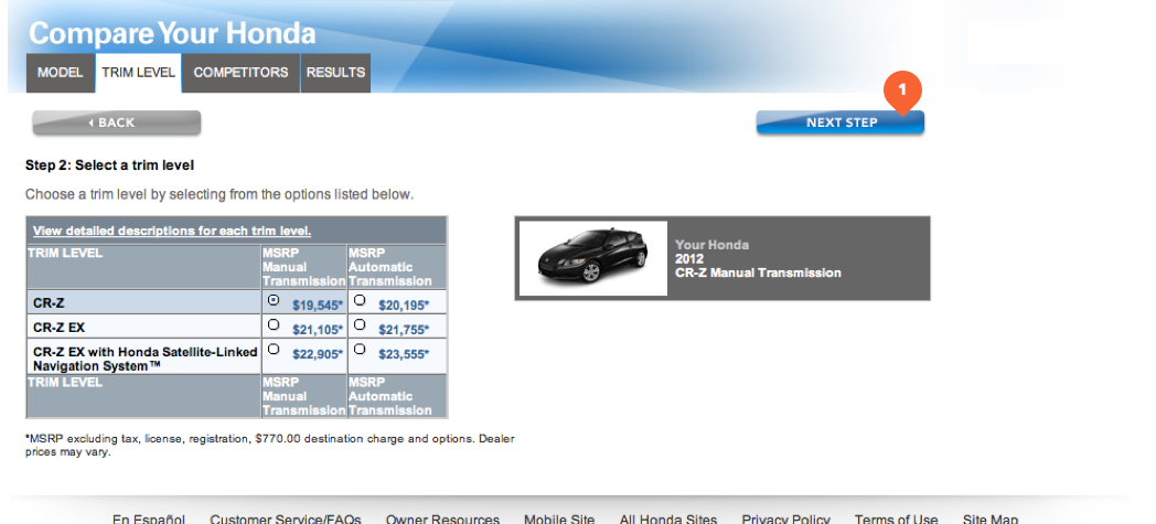
Analytics indicated that most drop-off occurred at the second step of the process. Looking at the second step suggested that the “Next Step” button was being cut off by the right edge of users browser windows because the old comparison tool was not responsive.
I performed a comprehensive competitive audit of other OEM comparison tools.
I proposed simplifying the language of the results categories to make them easier to scan and compare.
THE OPPORTUNITY
Most OEMs have a one-step process, e.g. they provide a competitive comparison topre-selected competitors by default.
Most OEMs provide competitive comparisons, Toyota provides a trim comparison tool. Few OEMs provide a model to model comparison tool.
Exploration and Iteration
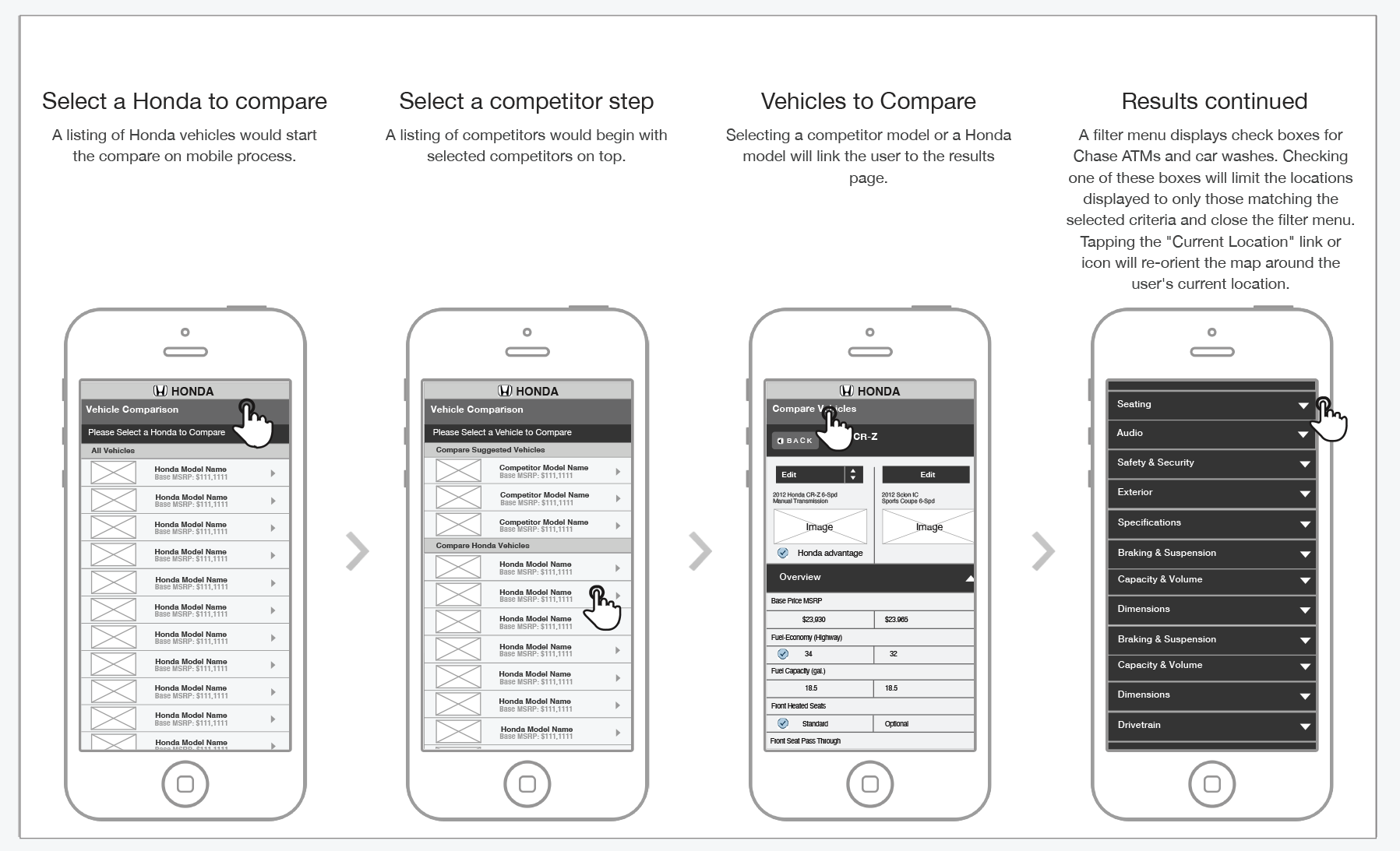
Sketches were mostly done on paper, many different UI interactions were explored including a change vehicle menu for quickly configuring the comparison.
The new compare tool would be responsive and the wireframes featured multiple breakpoints. I proposed fixing the headers at the top of the browser window as the user scrolled down, similar to how the headers in the iOS contacts app animate as the list is scrolled. I created a simple HTML prototype to demonstrate how the headers would behave.

I created a click-through prototype of the whole compare process to show how users will either be shown results immediately or choose a vehicle depending on their context.
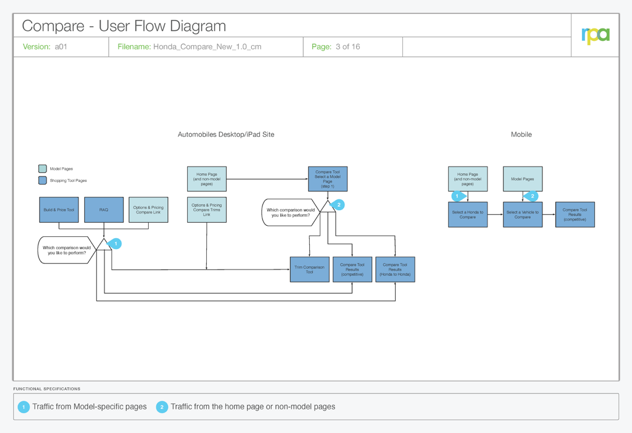
User flow
Traffic from model specific pages is directed immediately to competitive results for the model the user is currently viewing.
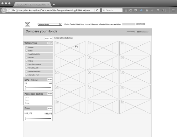
Wireframes
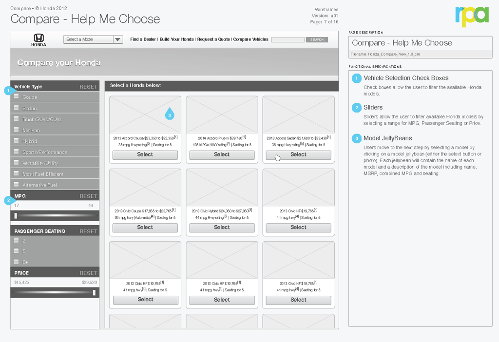
I added filters to the vehicle selection step.
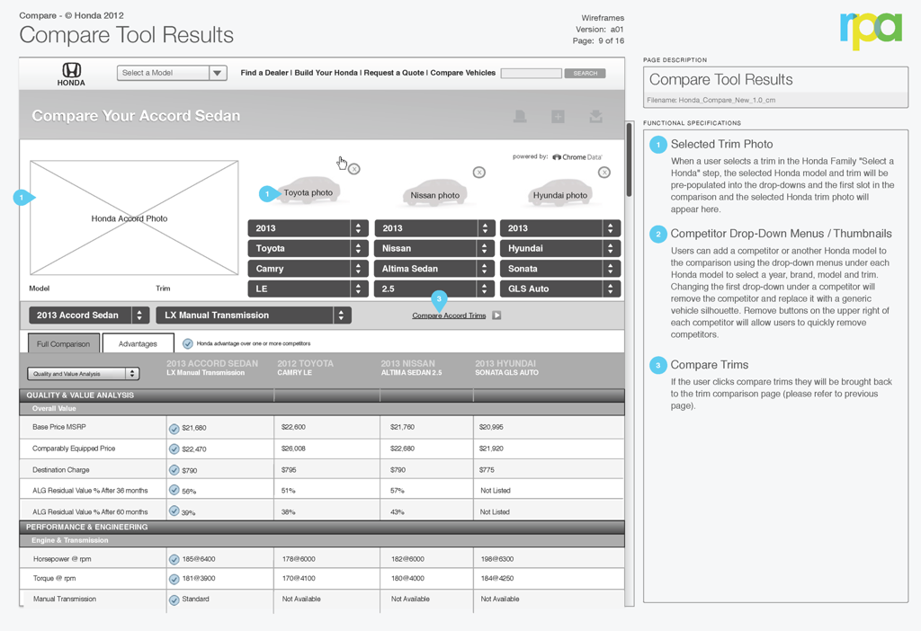
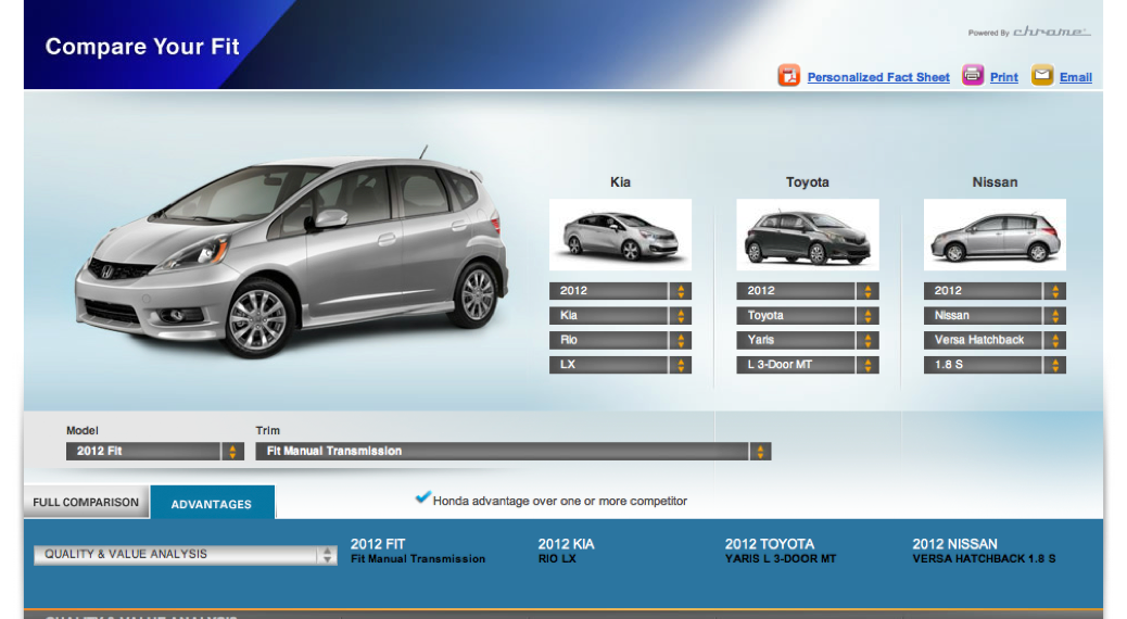
I added larger photos of the Honda model. We also included space for three competitive models and added a scrolling table with sticky headers to detail the results.
Finished design
Quinn Fu turned my wireframes into this finished designs.
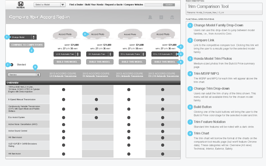
Phase Two: Adding Trim Comparison
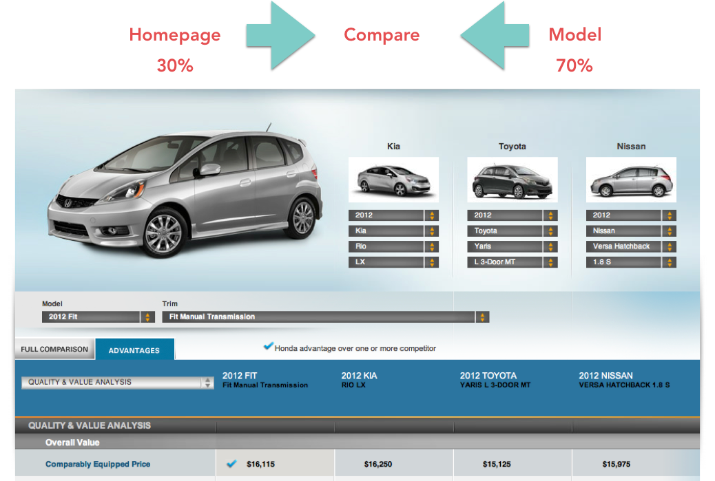
Analytics indicated that 70% of users accessed the comparison toolfrom a model page.
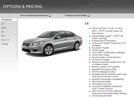
In addition, 42% of users who came from a model page came from the Options & Pricing tool. A trim comparison tool will make it easier to understand the differences between trims than the feature list shown below.
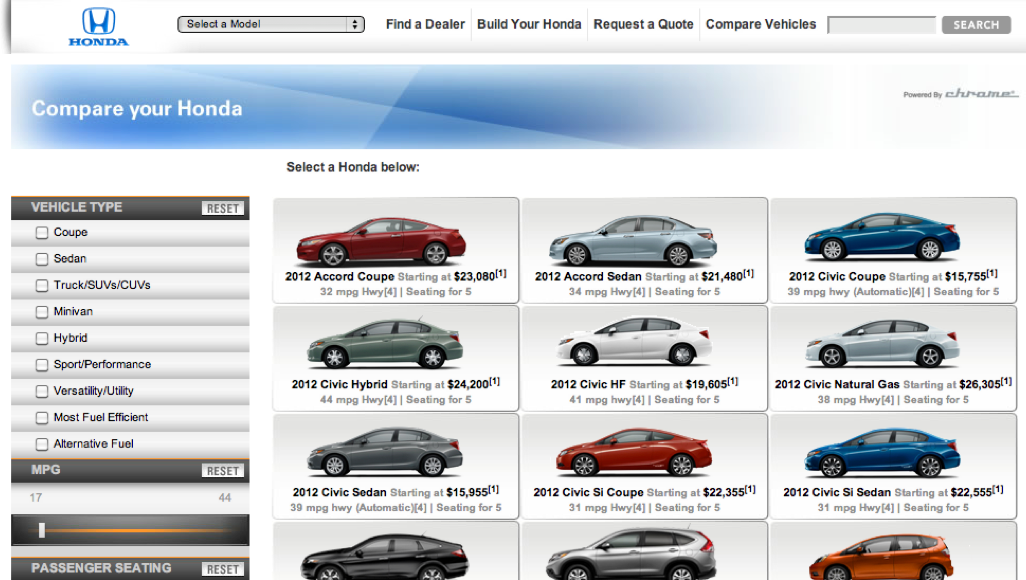
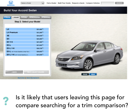
Analytics showed that 30% of users who started at the home page while 23% accessed the tool from Build & Price (pictured below).
A survey run on users of the Comparison tool discovered that 59% wanted to compare Honda models to another Honda.

Exploration and Iteration
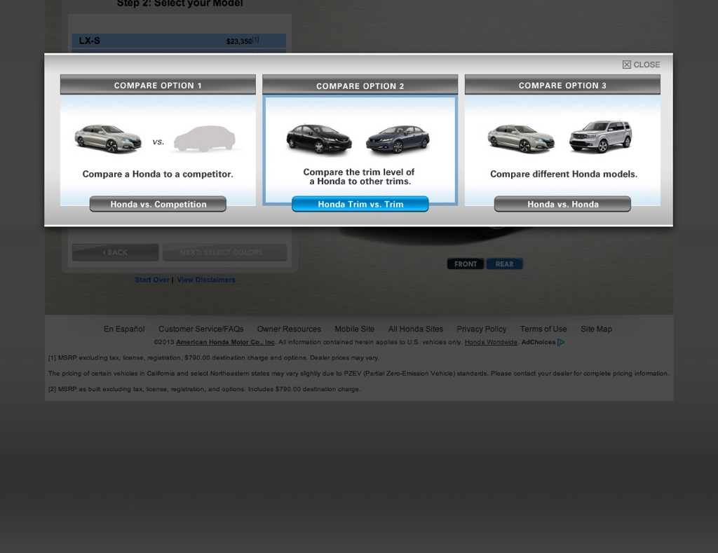
While inelegant, a modal window on model pages allows the user to choose between the two different compare use-cases to go directly to results.
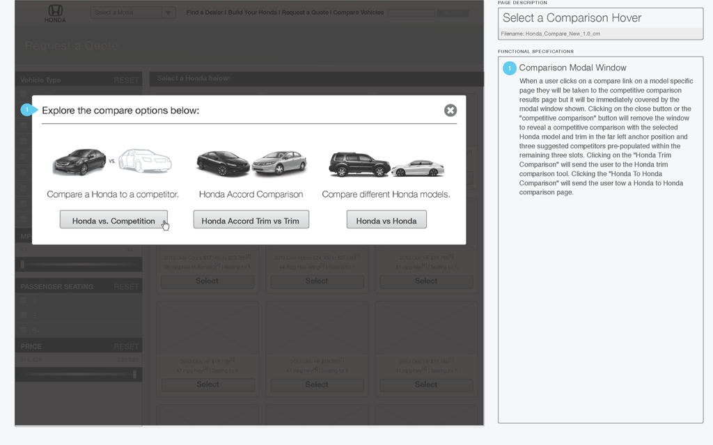
We added a trim comparison screen to the compare tool accessible from the modal displayed when the user clicks compare on model pages.
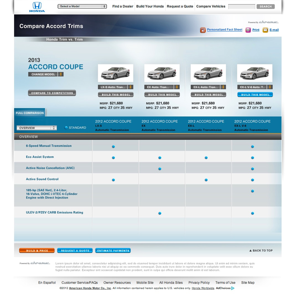
Finished designs
OUTCOME
Results and what I learned:
- Analytics data can indicate existing usability issues. Metrics like bounce rate, conversion rate and engagement can help measure the effectiveness of new design iterations.
- The new compare tool had a higher completion rate than the original tool.
- After the compare tool was redesigned to include trim-level data, the bounce rate from the compare results page to trim pages dropped.
Wireframes:
Honda Compare Tool: Wireframes [PDF]
American Honda: automobiles.honda.com
#ui #interaction