Shipping Re-Imagined

UPS Mobile App Case Study
UPS Hero Image
My role
Feb 2023 - Feb 2025
  • Design research
  • Prototyping
  • UI/UX design
  • Visual design
Team
  • Chuck McQuilkin, Mobile Designer
  • Joseph Banjo, Project Manager
  • Francis Djabri, User Research
  • Design team at AKQA (Digital Agency)

Project Overview

The product
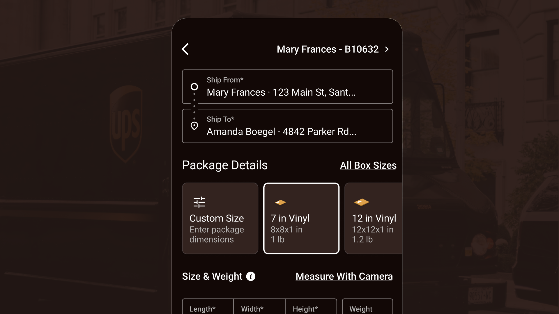
In January 2024, we launched a new UPS Mobile app for iOS and Android.
Project duration
February 2023 to January 2024
The problem
The existing mobile app was a frustrating experience for users who encountered a clunky design that felt more like a website stuffed into an app. Key tasks were slow, navigation was confusing and the app lacked consistency in its design and functionality making it hard for users to understand or trust the experience.
The goal
More users (108MM MAU) visited UPS.com, many on mobile web, while approximately 4.6 MAU use the native mobile app. The goal is move more users to the native app by giving them an appealing interface on their devices, and allow users to ship packages and make delivery changes on their app instead of calling support. The native can provide a better experience by retaining their tracking history, remembering their preferences and their contacts and integrating with notification and location services and contacts on the device.

The mobile app makes it easier to make delivery changes like giving your driver instructions, divert the package to a neighbor or to a UPS location or change the delivery date. The new app will connect physical and digital touch-points.

The new app would be a customer-first design and can use the device's camera to capture 1Z numbers and QR codes to facilitate tracking packages and sharing address information with associates at The UPS Store. It can also use the user's device to locate The UPS Store locations, drop boxes and UPS Access Points to help users drop off or pick up shipments and get directions.
My role
I did UX design, research, prototyping, and visual design for this project. I came late to the project, primarily designed by AKQA, and worked on the issues we needed to develop before launch. I worked with the team on the design of various parts of the project, including redelivering to my address, scheduling a pickup, saved address treatments, notification management, shipping notifications, location-aware notifications, the onboarding flow, disclaimers, promo codes, in-store mode calendar, international domestic shipping, international payment types, the Xamarin sunset message, accessibility issues and many more. Later, senior leadership asked me to make a prototype to address some problems uncovered during a usability test.
Responsibilities
Creating high-fidelity mockups of mobile UI and high-fidelity prototypes in Figma. Advising UPS on how designers should organize Figma files in the future. Contributing to the UPS Mobile Design System.
Foundational User research
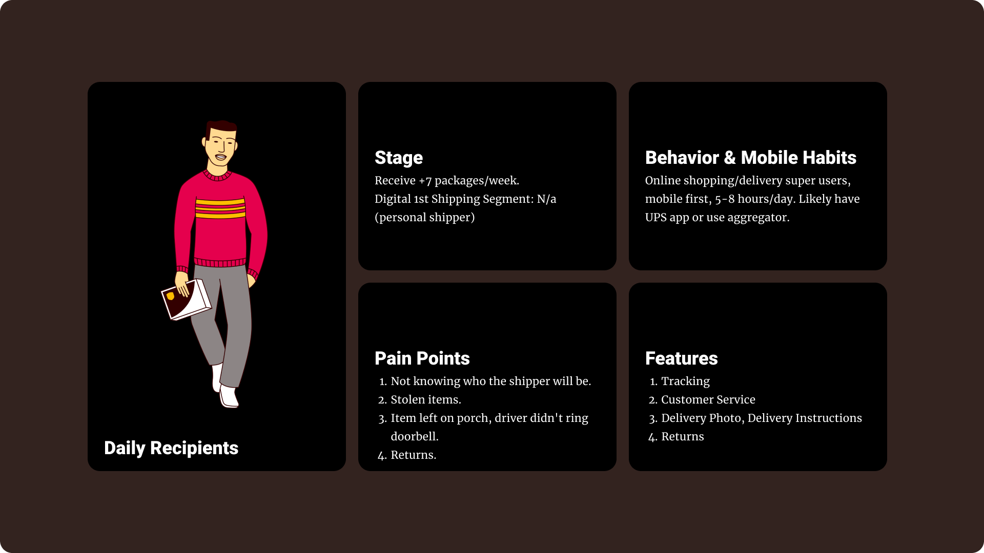
Pain points
  • Lack of updates in delivery progress
  • Waiting in line at the post office
  • Struggling with 1Z numbers and manually tracking shipping numbers
  • Stolen packages
  • Item left on porch/driver didn't ring the doorbell
  • Returns
Post-Launch User research
Summary
When the app launched it had a dedicated tab for user profile information and a hamburger menu that contains a mixture of profile information and navigation menu items. Some menu options were repeated between the hamburger menu and the profile tab, creating redundancies and possible user confusion. The goal of the follow up study Francis ran was to understand how users categorize the menu items to inform a new information architecture.

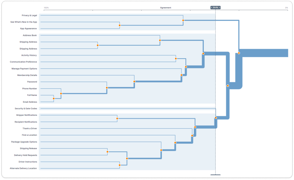
Card sorting is a tool for understanding user's mental models and how people categorize information. Card sorting is an activity where participants are asked to sort 'cards' into different categories based on what makes sense to them. The output of a card sort shows how concepts and information relate to each other and informs decisions about how to structure the content.

The card sort study was run with 100 participants, 40 of whom were small business people (customers and prospective) and 60 were consumers (customers and prospective).

User Persona

Daily Recipient User Persona

Tree Graph / Table

Card sort result tree chart
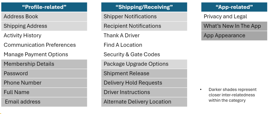
All items beneath a node are related to some degree-the further to the left a node is, the closer the relationship is for the child items. This graph indicates that participants have sorted the menu items into 3 main branches. Within each category, there are also some potential sub-groupings of items that have high relatedness.
Card sort results table

High-fidelity Designs

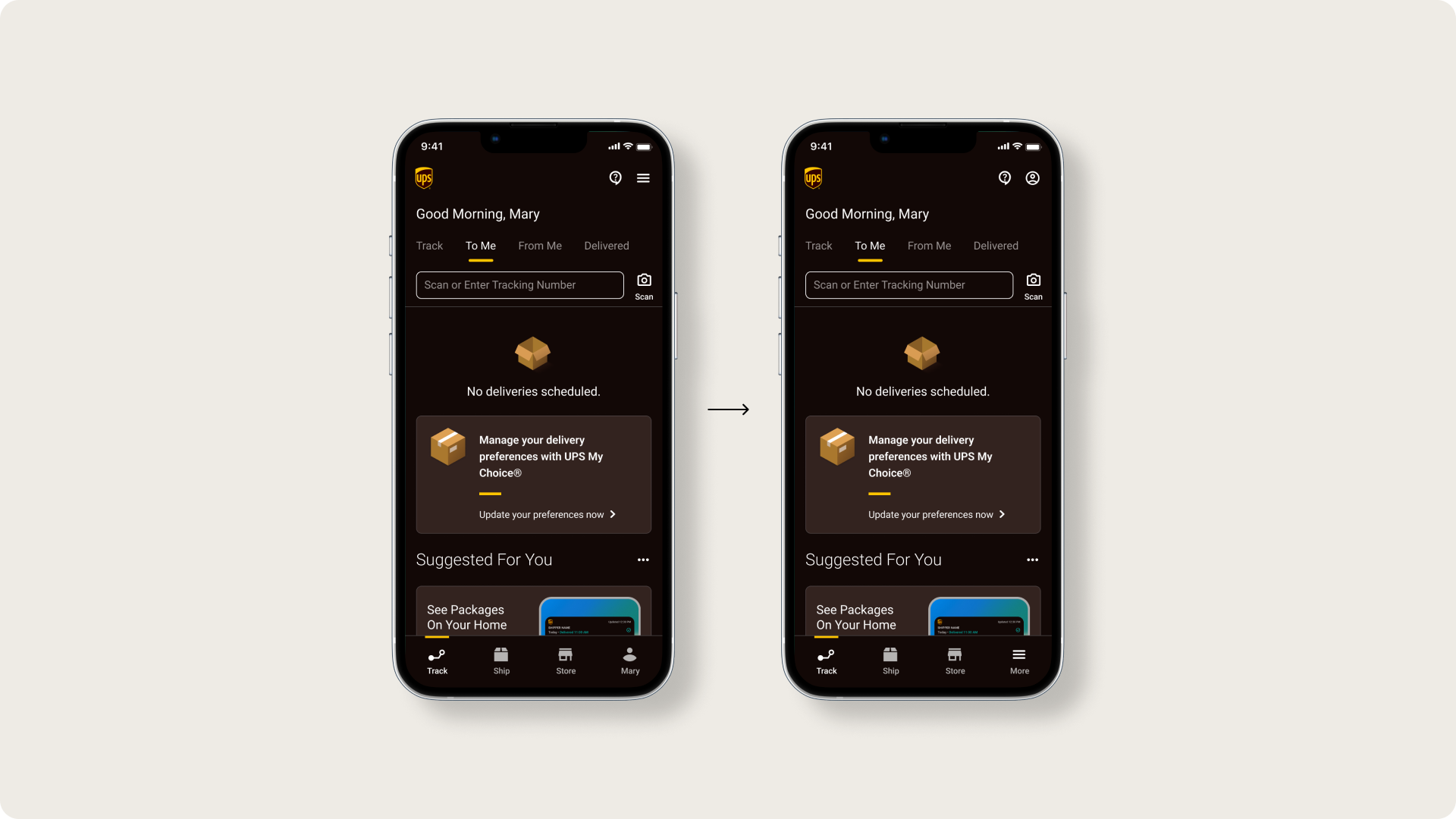
Before and After menu redesign
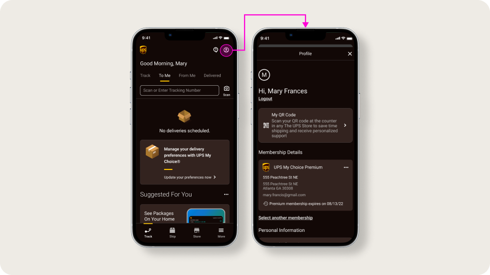
I chose to replace the hamburger menu with an account icon to designate the top menu as the user menu. The bottom tab bar gets a hamburger menu icon and a 'more' label. Following the categories from user research I created an address section of the profile menu for shipping address and address book (once it is developed). I also added a membership details section to the profile screen and located the other profile-related info in a section called personal information. I created a section called payments and preferences for activity history, communication preferences and payment options (once these get built).
Mockup showing new user menu button and the button to launch it
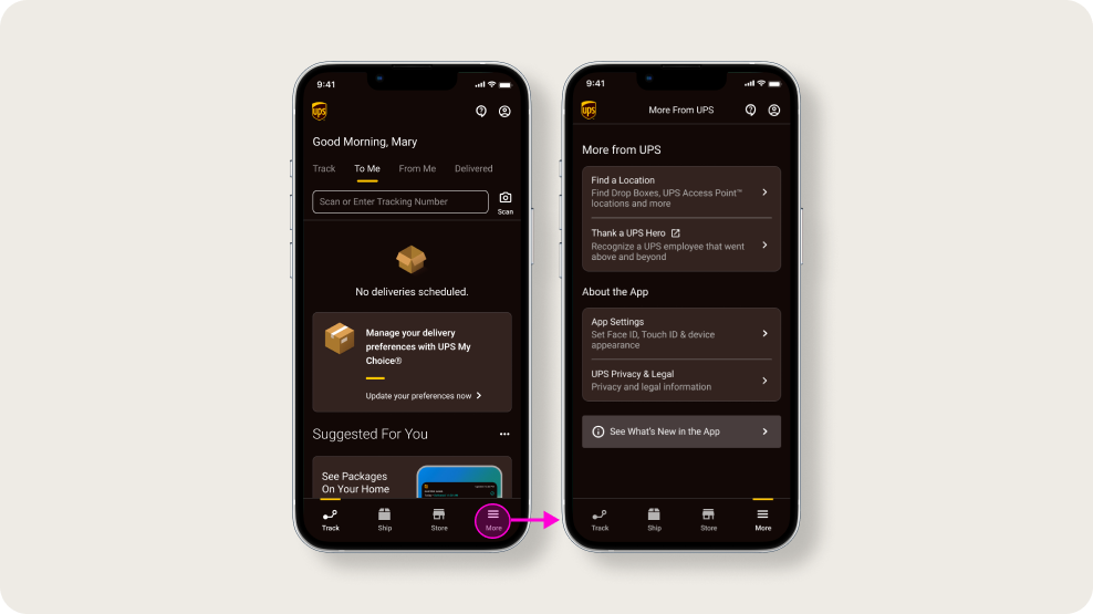
I located find a UPS location, thank a UPS hero in the more menu and created an about the app category for app settings and privacy and legal and what's new in the app.
More menu and more button that launches menu
I located find a UPS location, thank a UPS hero in the more menu and created an about the app category for app settings and privacy and legal and what's new in the app.
High-fidelity prototype
The prototype shows how the new user menu and the 'more' menu operate.

UPS app user menu prototype
Takeaways

An extremely complex mobile app that contains all of the touchpoints in UPS's delivery service and represents all of the edge cases. The extensive and comprehensive mobile design system made the work much more manageable. No matter how close the product is to being completed, user testing can highlight areas for improvement.

Next steps
  • Conduct another round of usability testing to validate that the user pain points have been adequately addressed.
  • Conduct more user research and monitor analytics to determine how the app may need to evolve to meet user's needs and expectations over time.
Outcome
The UPS App launched on iOS and Android and total downloads are trending upward and hit 468K in August 2024. Customer satisfaction with the new app as measured by NPS has improved from 0.4 to 37.4. The native mobile app reduces call volumes by allowing users to make changes to their deliveries without having to call UPS. Change delivery screen views in the native app were over 6MM year to date and currently increasing 8% week over week.
UPS App on iOS UPS App on Android