Food4Less Case Study
Food4Less Case Study
My role | Aug 2021 - Jan 2022
- UI/UX design
- UX Research
- Prototypes
Team
- Chuck McQuilkin, Design
- Shannon Lieberman, Design
- Jason Berkley, Project Manager
- David Howard, Android Developer
- Nguyen Tran, iOS Developer
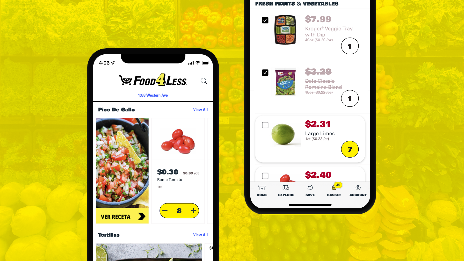
Food4Less is a discount grocery chain. A significant portion of Food4Less’s customers speak Spanish, and the existing app had no support for multiple languages. The project was to take a white-label app built to support English and Spanish, adapt it to fit Food4Less’s brand guidelines, and add a grocery list feature to the app. For this project I:
- Wireframed and prototyped the new grocery list function with a click-through Figma prototype
- Ran a usability study testing out menu item names
- Produced High-fidelity UI designs of the new app in Figma
THE PROBLEM
Food4Less’s current app did not have multi-language support, and Food4Less wanted to make it easier for Spanish-speaking shoppers to create shopping lists and shop in-store or to use the app to order groceries for delivery.
COMPETITIVE RESEARCH
We looked at 20+ grocery and to-do list apps to evaluate their strategies, determine the strengths and weaknesses of other grocery apps, and find to-do list apps with features that we might emulate.
We also looked at to-do list apps to gather insights into how best to organize a grocery list app.
Our main insights were:
- We could not find a U.S. market Spanish language grocery store apps that offered grocery delivery.
- H-E-B’s shopping list has an integrated search function, making it easy to add new items.
- H-E-B had a “cart” mode and a “shopping-list” mode which we thought was clever because it gets around the problem of having an Add to List button, and an Add to Cart button on every grocery item and add to list button, and an add to cart button
- Out of Milk allowed adding items to a list from history, which would facilitate repeat purchases for Food4Less
THE OPPORTUNITY
Food4Less’s app could be the first major U.S. grocery store app that offers delivery ordering in Spanish. Many grocery shoppers have transitioned to delivery or pickup over the last year and a half. A useful grocery list feature could help retain users. Multi-language support would also help Food4Less compete directly with local mercados who have always communicated Spanish to their customers.
Exploration and Iteration
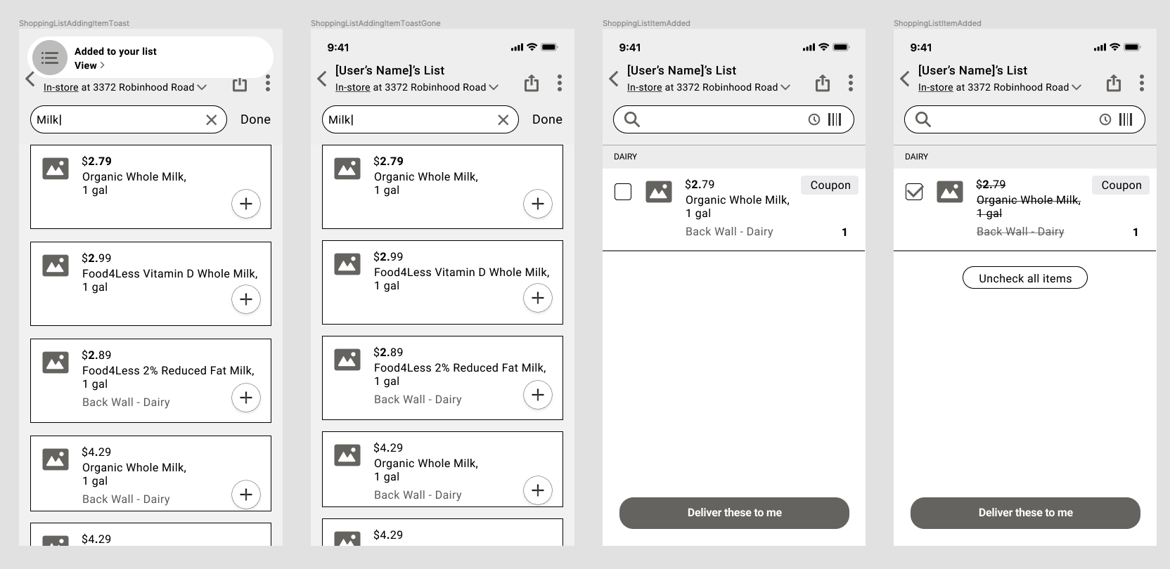
We started by prototyping the grocery list functionality with a wireframe prototype that incorporated product search, a bar code scanner, an empty state for new lists, and accessible via a floating action button (FAB).
View the Figma wireframe prototype: Figma
This prototype featured a delivery in-store toggle that allowed a single button on each grocery item. In delivery mode, the product tapped would go into the user’s cart; in the in-store mode, it would go onto their list. The prototype incorporated many features discovered through the competitive audit, including adding an item from history and a FAB for the cart or list.
We started to add in colors to explore how Food4Less’s brand colors might come together with the existing UI from the white label app and the new functionality (grocery list).
User Testing
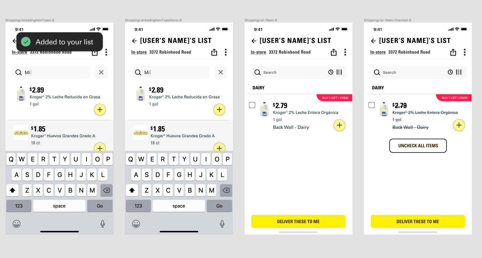
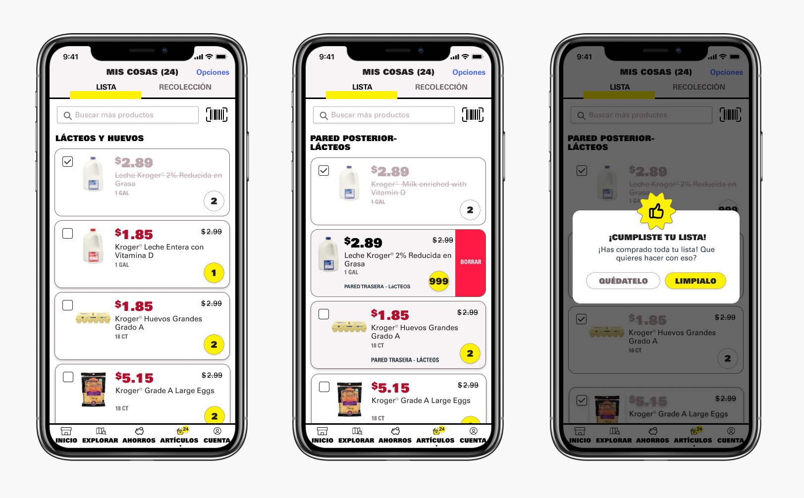
The FAB ended up being out of scope, so we revised the design to stick closer to the existing white label app and put the cart and list on two tabs within a single screen accessible from the bottom nav. Labeling that screen was a challenge because if it is named “cart,” users may not expect it to contain a shopping list, and if it is called “list,” users may not expect that it includes their cart.
We ran a click test usability test in English and Spanish to determine the best label for the navigation item that would indicate to users both shopping list and cart.
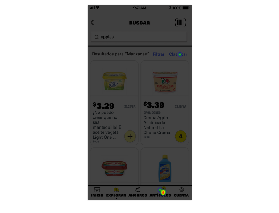
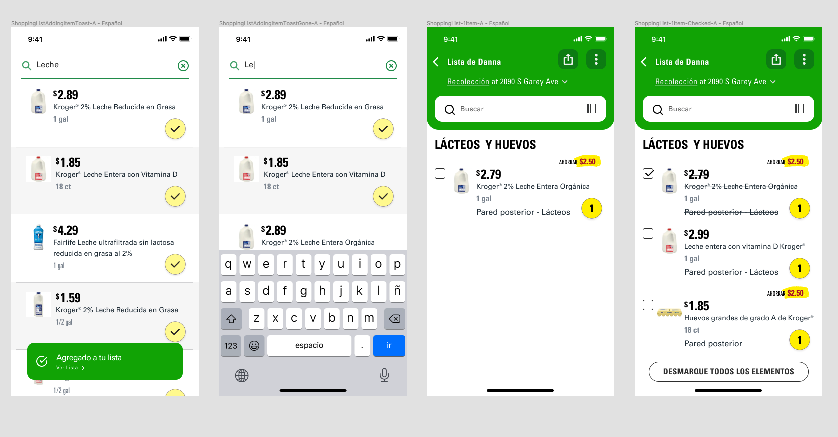
Above the results in Spanish, below in English. 4/6 of users were successful on their first try at identifying the UI item that would display their shopping list or cart, and half were confident in their decision. A third is also satisfied in their choice and a third (2) who are somewhat not confident. We recommended keeping “Articulos” as the item label because it tested with higher success & confidence than “Basket.”
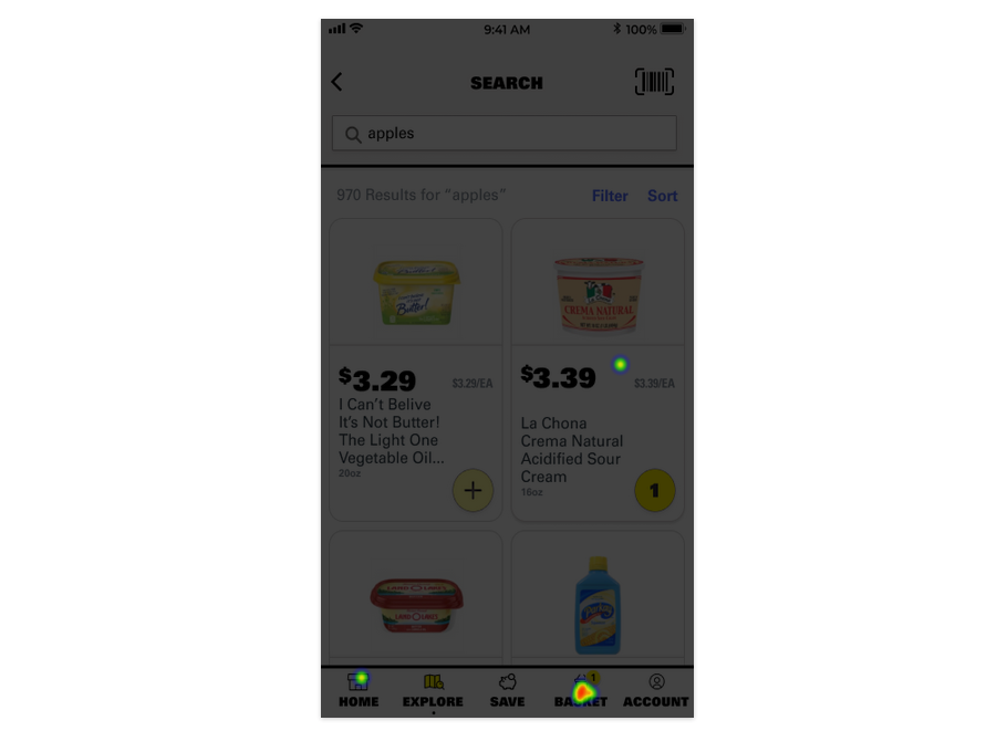
Here are links to the full test results in Spanish and in English.
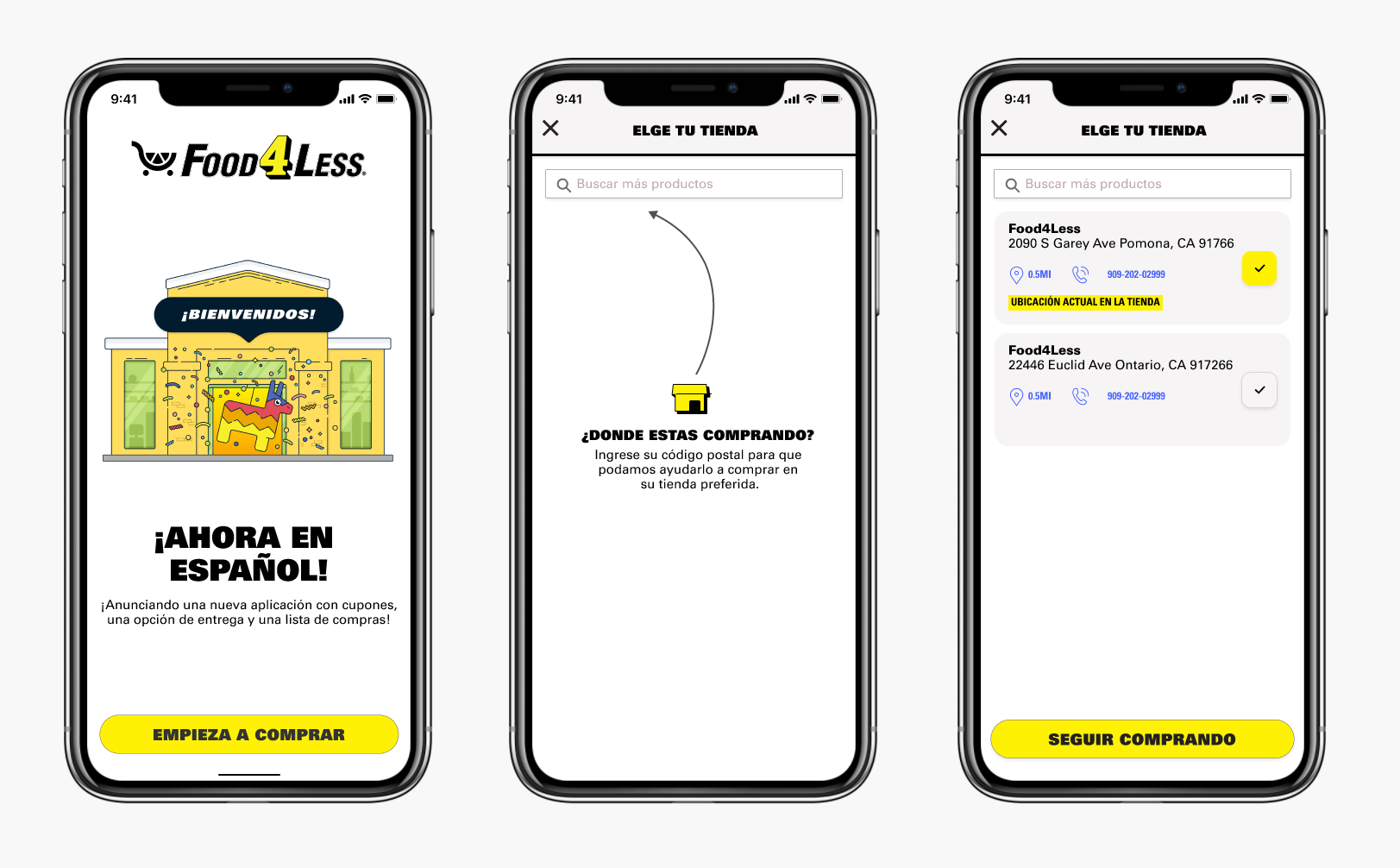
Hi-fidelity designs
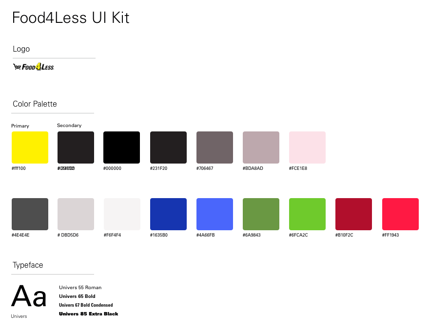
We used Food4Less’s brand font Univers and brand colors to develop the final visual design.
Below are the final visual designs (in Spanish).
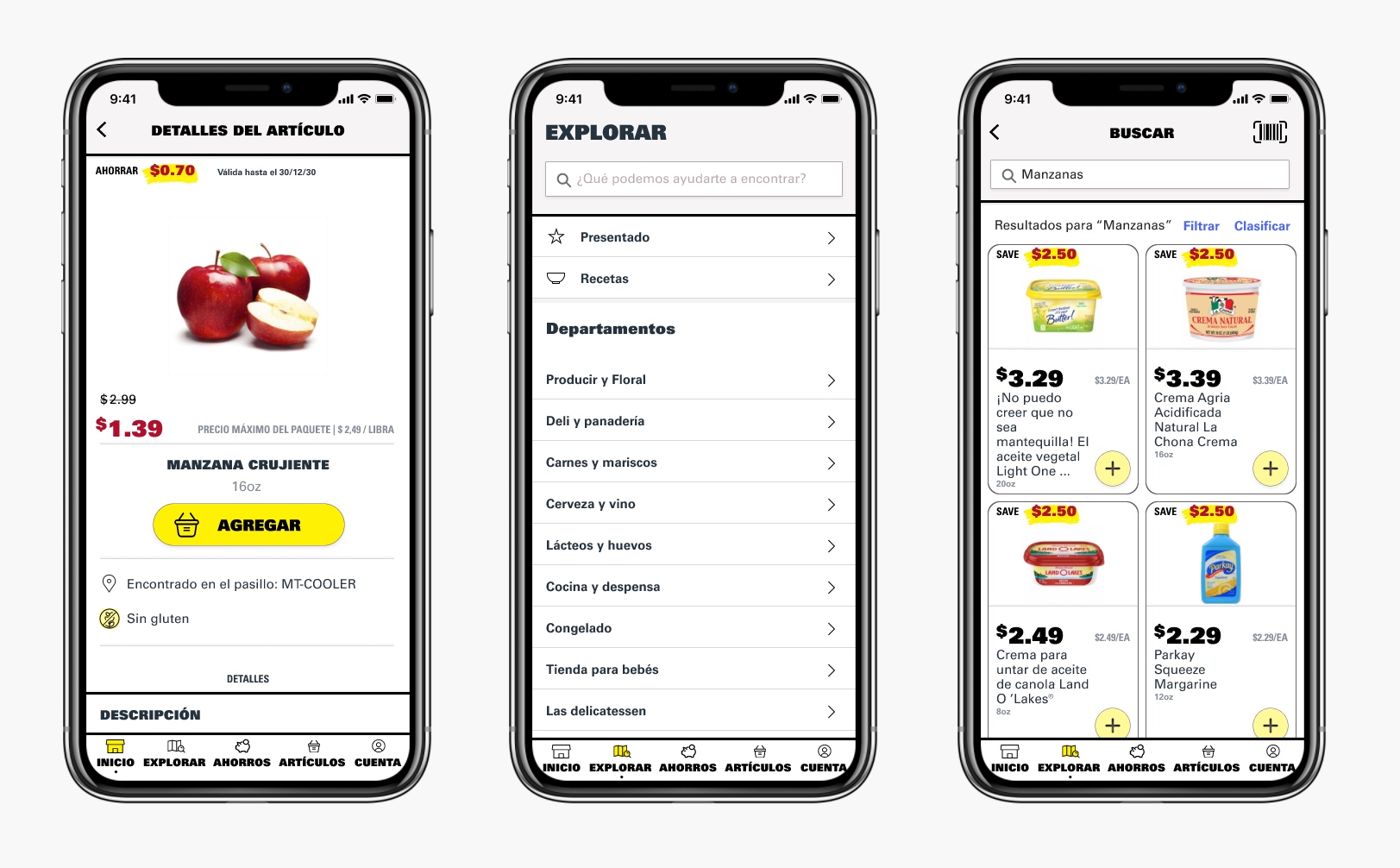
Hi-fidelity Figma UI: Figma
OUTCOME
The launch of Food4Less’s new app will coincide with the launch of a new website and new branding for the chain.
#ui #interaction #mobile