Sluice App Case Study
'Uber for home appraisals'
My role | October 2018 - March 2020
- Design research
- Journey mapping
- UX design
- Final visual design
- Prototypes
Team
- Dan Howard, Project Manager
- Khuong H, Developer
- Dashiell Sublett, Developer
- Diego Espinosa, Developer
- Sam Brown, Developer
- Tom Nelson, Developer
- Skylor Stewart, QA
- Michelle Jewell, User Researcher
Sluice was a new app (iOS, Android) built to streamline assigning appraisal work to eligible appraisers. I took over the project as the team focused on promoting Sluice and driving user adoption and retention. For Sluice, I worked on:
- Creating personas of Sluice users
- Improving the floor plan tool
- Designing and documenting a "magic link" onboarding flow
- Created an onboarding video to introduce the app to new users
THE PROBLEM
Sluice was being adopted by new users very slowly. I worked with our researcher to better understand who our users were and why they were not using Sluice.
Stringent technical and budget constraints meant that we had to focus on low-effort and high-reward improvements.
USER RESEARCH
I worked with Michelle Jewell, InMotion's researcher, to interview and survey Sluice users to better understand how they use Sluice and how we can make it more useful for them.
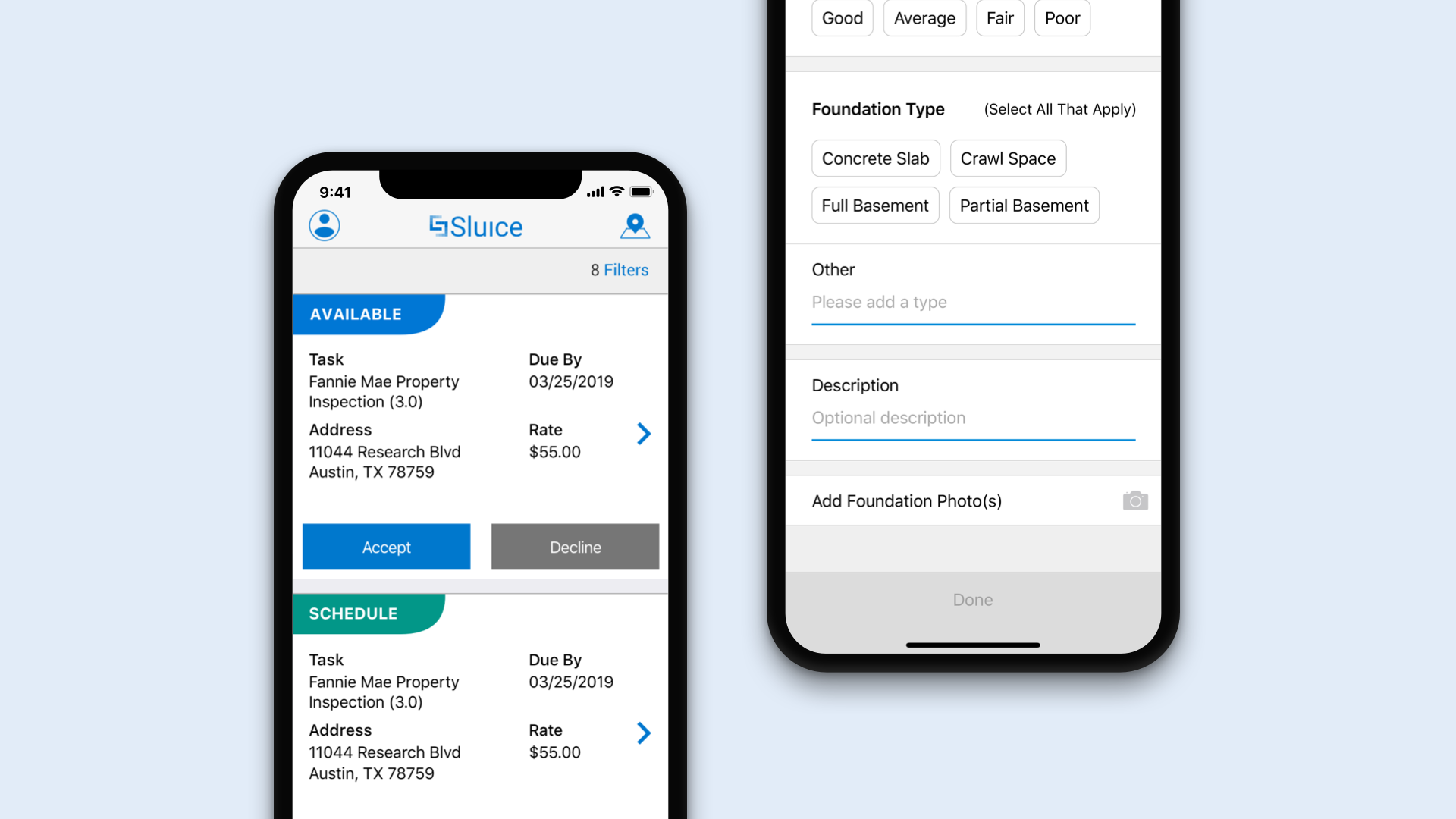
We found that the floor planning interface did not match the mental model of the appraisers. Appraisers typically draw floorplans by walking around the outside of the structure, measuring an outside wall, then drawing a line, then measuring again, then drawing a line until they have an outline.
Sometimes appraisers label portions of the shape with room names, but they never add in furniture or interior details. We proposed eliminating unused features from the floor plan tool.
Many appraisers found the floor plan navigation confusing because of items they didn't need or use and unfamiliar terminology.
Journey Map

We drew a journey map on a whiteboard showing an appraiser's work process and insights we learned along the way.

We created a journey map that showed Sluice could retain more users by making it easier for appraisers to:
- Schedule their inspection visits
- Calculate gross living area (GLA)
- Adjust for second-story GLA (subtract stair area)
- Answer or (prevent) follow up requests surrounding the report
- Gathering comps

We created a diagram to explain who orders which type of appraisal and who completes each appraisal type. The drawing shows where Sluice fits into the overall market and potential areas to expand.
Personas

I created ten personas based on our research. Five of the personas were appraisers, and there was one persona for assignment reps, quality control, vendor management, and two real estate agent personas. The appraisers and real estate agents were Sluice’s primary users while assignment reps added orders to the app.
THE OPPORTUNITY
We had to focus on low-effort/high-reward improvements to Sluice that would make appraisal work easier. We identified several:
- UX improvements to the floor plan tool with low-dev effort
- Design and implement Magic Link onboarding
- New App Store Screenshots and Marketing video
- Minor cosmetic updates to the UI
Exploration and Iteration

Sample wireframes documenting the top level of a complex Sluice form and the first branch.
Floor Plan Tool UX Improvements

Floor Plan tool improvements:
- Show dimensions by default
- Show grid by default and make items snap to the grid.
- Hide unused items
- Rename menu items to fit the appraiser mental model
'Magic Link' Onboarding

To simplify onboarding to improve user acquisition rates, I proposed onboarding new users with a variation on the "Magic Link" process pioneered by Slack.
A link in the onboarding emails sent to new users contains an authenticated URL that allows the user to log into the app with one tap. Initially, Sluice required users to log in and then fill out 12+ screens of forms to create a profile before the app lets users start looking for jobs.
Once the user chooses a new password in the new flow, they are automatically redirected to the correct app store for their device to download Sluice.
When the app downloads and the user logs in, they see an onboarding carousel explaining the main benefits of using Sluice. Because InMotion created the user's account in advance behind the scenes (to generate the authenticated links), they typically see new jobs they can accept when they log in for the first time instead of an empty job queue.
Onboarding Video
To explain the new onboarding process and the benefits of using Sluice, I put together a promotional video.
OUTCOME
Results and what I learned:
- The conversion rate for users who clicked the magic link was 100%.
- I had to work under stringent technical constraints but still advocated for what I believed was essential to improving the user experience.
- I learned that sometimes it's best to say no to new features.
- I created a graph to help explain to stakeholders our progress in improving the email conversion funnel.
Prototypes:
Sluice onboarding prototype: Invision
Sluice dashboard prototype: Invision
Video:
Sluice Onboarding Video: Youtube
Sluice on the App Store: Download Sluice from the App Store.
#ui #interaction #mobile