240 Tutoring Case Study
Redesign an edTech Platform
My role | September 2018 - October 2018
- UX design
- Information Architecture
- Prototypes
- Final visual design
Team
- Matthew Jewell, Design
- Chuck McQuilkin, Design
240tutoring is an EdTech company focused on preparing teachers for certification exams. They needed an app redesign to boost usability and enhance learner metacognition (teaching learners what they know). For 240 Tutoring, I worked on:
- Creating a site map of the existing website
- Redesigned dashboard to increase metacognition
- Mobile, tablet, and desktop breakpoints
- Created an onboarding video to introduce the app to new learners
THE PROBLEM
Students often skipped the self-assessment. To enable adaptive learning, students need to take a self-assessment to "place" them and adapt the content to their needs.


240 Tutoring also needed to discourage students from taking the practice tests too early because 240 offers a money-back guarantee based on the student's practice test performance, but only had three full-length practice tests. The redesign would also enhance the appearance and readability of the content.
USER RESEARCH

I created a site map of the old 240 Tutoring website and reorganized the content to streamline the student experience.
I created a content inventory of the old 240 Tutoring site. The goal was to determine what to keep, what to change, and what to discard.
We interviewed new teachers who had recently studied for their teaching tests to understand 240 Tutoring's learners.
THE OPPORTUNITY
Learners want to know how close they are to achieving a passing score. Adding prominent progress indicators based on psychometric indicators derived from practice test results will help learners feel more confident about where they stand and get more out of the platform.
- Redesign IA (information architecture) and navigation
- Design progress indicators
Design Sprint

A week-long Practical Design Sprint resulted in a validated prototype that dynamically highlighted the learner's progress.
We then redesigned the web app from first time to user experience to completion certificate and performed two rounds of usability testing.
Exploration and Iteration
We jumped from Sketch wireframes to a prototype, then high-fidelity mockups based on those wireframes at a rapid clip.

The self-assessment modal treatment explains why students should take the self-assessment.
The redesigned self-assessment interface (below) features questions with generous tappable multiple choice selections that clearly indicate the learner's answer choice.

When a student gets a question wrong (above), it is crucial to clarify which question was selected and which answer is correct because this is a practice test.

An adaptive animation with animated percentages and graphs demonstrates to the learner that the course has adapted for their needs based on the practice test results. The recommended course in each unit is highlighted (below) based on the self-assessment.

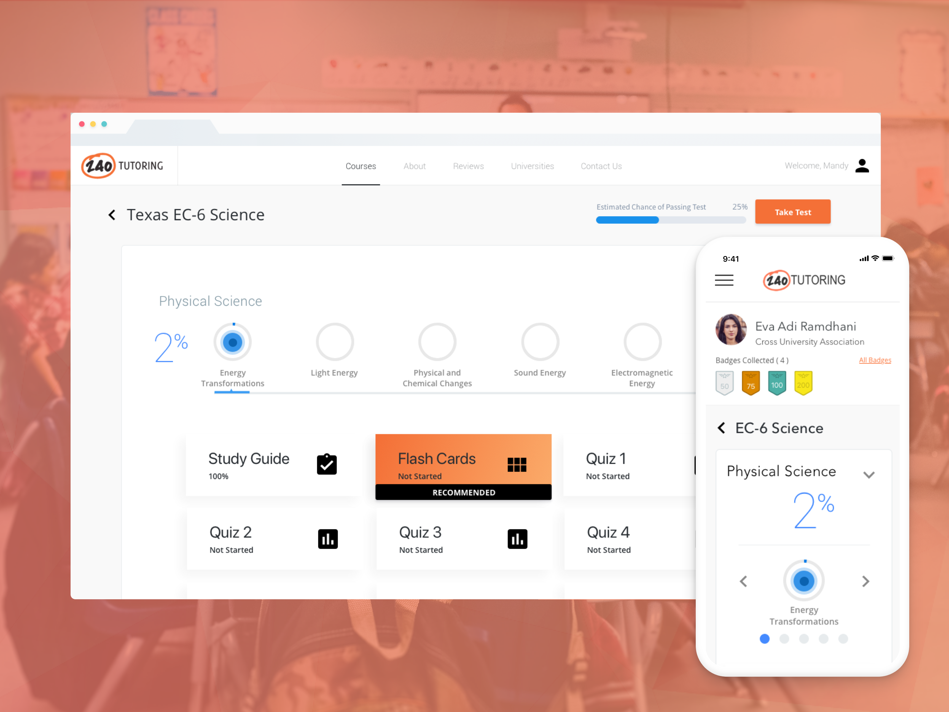
The top of the courses screen (below) features student progress and organizes the courses in accordions that show course progression.

I designed an Estimated Chance of Passing module to discourage learners from taking the practice test too early. A bar graph indicates the student's remaining attempts and their estimated chance of passing.

I redesigned the study guide to enhance readability with typography and responsive layouts.

Redesigned flashcards enhance active recall with improved typography and flip animations.

USER RESEARCH
We ran a SUS usability study on the new product:
| U1 | U2 | U3 | U4 | U5 | U6 | U7 | U8 | U9 | U10 | Total | |
|---|---|---|---|---|---|---|---|---|---|---|---|
| SUS Score | 95 | 95 | 87.5 | 90 | 85 | 97.5 | 95 | 90 | 80 | 100 | 91.5 |
OUTCOME
Using the validated Design Sprint prototype as a guide, we then redesigned every facet of the web experience, from initial signup to completing their certificate. After performing two rounds of usability testing, we produced the final high-fidelity designs in only six weeks.
Results and what I learned:
- I delivered high-fidelity mockups for three breakpoints.
- Usability testing confirmed that users understood that the new product had a recommended study path but could deviate from those recommendations.
- The new product has an average SUS score of 91.5.
Prototypes:
240 mobile prototype: Invision
240 desktop / tablet prototype: Invision
#ui #interaction #web_app