Using a Design Sprint to Solve a Problem
Pearson Case Study
My role | 2019 - 2020
- Design research
- Design Sprint
- UX design
- UI design
- Prototypes
Design
- Kylie Pentecost, Product Manager
- Tracy Mihm, Business Analyst
- Naveen Prabakaran, Project Manager
- Gokul Purushothaman, Developer
- Chuck McQuilkin, Design
Pearson Access is a web application used by schools, school districts and state education officials to administer online tests and collect and manage the results. I was the sole UX/UI designer on the project. I worked on:
- Interviewing users
- Creating personas of Pearson Access Next users
- Design Sprint
- Documented new IA and new flows with wireframes
- Created multiple prototypes to refine interactions
- Worked with Accessibility team to reach AAA+ color contrast accessibility
- Created a style guide website with all fonts, colors
THE PROBLEM
Improve the overall user experience of Pearson Access. Pearson Access was difficult to navigate and too complex for most users. Users must choose their organization, then select their session in a large dropdown in the upper right hand corner of the screen every time they log in.
A prominent task menu (above) was used to complete nearly every important task. It was confusing and tool up valuable screen real estate above the fold on every screen. Task menu and data 'shopping cart' waste valuable real estate on every screen.
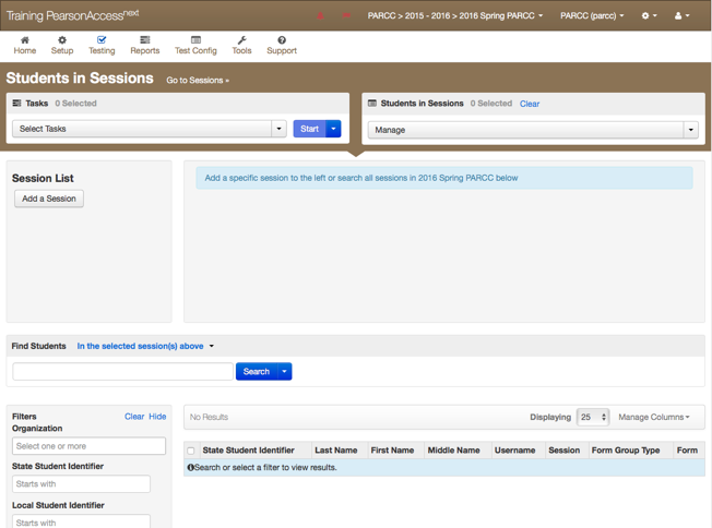
On the students in session screen a 'shopping cart' menu (above) had to be used to select a session to administer.
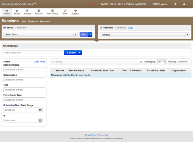
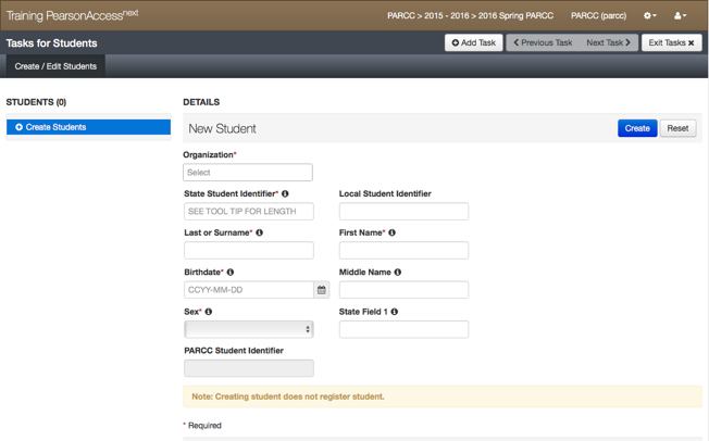
Data tables (above) do not show any results by default. This design runs search filters down the left hand column and mostly hides them below the fold. Data entry and edit screens (example below) are poorly designed.
Although a heuristic evaluation shows opportunities for improvements, we will follow a user-centered design process and identify user needs. The business goals of the redesign were to make the new UI to be a selling point for the product and to reduce IT support volume.
USER RESEARCH
I conducted more than 14 in-person user interviews in six states. In the interviews I clarified pain-points and identified key tasks. I also talked extensively with colleagues in technical support to understand what issues users have with the product most often.
Most users complained about the difficulty in finding their session, moving students from one session to another and re-starting students when something went wrong.
Personas
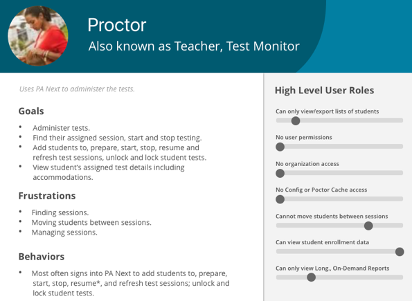
I created personas to determine who our users are, what their goals are, what their frustrations with the current system are and what their key behaviors are.
User Roles and Pain Points

I created a Venn-diagram of user roles to show where they overlap. Some of the most useful user feedback was captured in verbatim quotes from users.
Verbatim feedback from users:
Most wanted feature: "Reducing number of clicks to create a student, editing a student."
- Teacher in Florida (Tallahassee)
Most difficult task: "Searching for a session, creating a student"
- Teacher in Florida (Tallahassee)
"We hate multiple screens (to create students)."
- Heather (Florida) 12-5-16
"Student test status is the most important filter. It should not be hidden under a toggle."
- Mark Butler - Florida (Tampa Bay Area) DAC
"It would be nice if there was a column named 'status' and you could sort that."
- Mark Butler - Florida (Tampa Bay Area) DAC
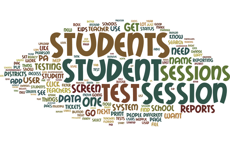
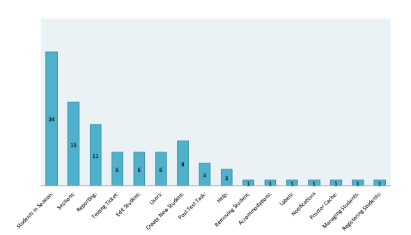
But to make sure that our redesign was not pulled in any direction by a single user or a small group of users, I studied the feedback more holistically. A Wordle shown below illustrates the most common pain points.
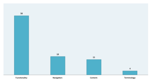
I graphed the usability issues identified by users by category and task.
THE OPPORTUNITY
I found that 90% of Pearson Access's users are proctors. They sign in to proctor a single test and most view only a single organization. They also spend all of their time on the “Students in Session” screen.
I proposed running a Design Sprint focused on developing a prototype focused on streamlining the usability of the four main use cases for these users. The prototype would be just the students in session screen where most users spent their time. The goal of the redesign would be to optimize the four leading tasks:
- Finding Sessions
- Finding Students
- Printing Test Tickets
- Monitoring Testing
Design Sprint
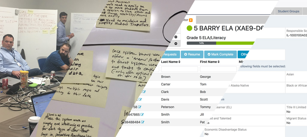
Over a four day sprint we developed a clickable prototype of the students in sessions page. To evaluate the prototype, it was shown to a dozen PA Next users who agreed that it simplified the user experience for the four targeted tasks.
Exploration and Iteration

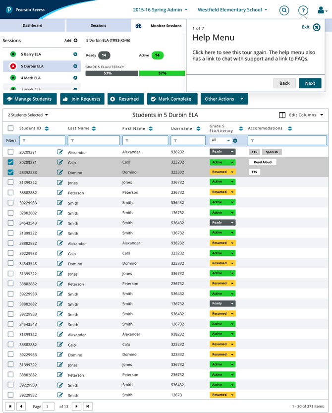
Wireframes I created worked out the details and UI elements not present in the Design Sprint prototype. I designed new simplified interfaces for moving students between sessions and entering student data into the system. New data tables pictured below feature sortable toggles on the table headers and a row of filters to allow the user to quickly search a column for an item.
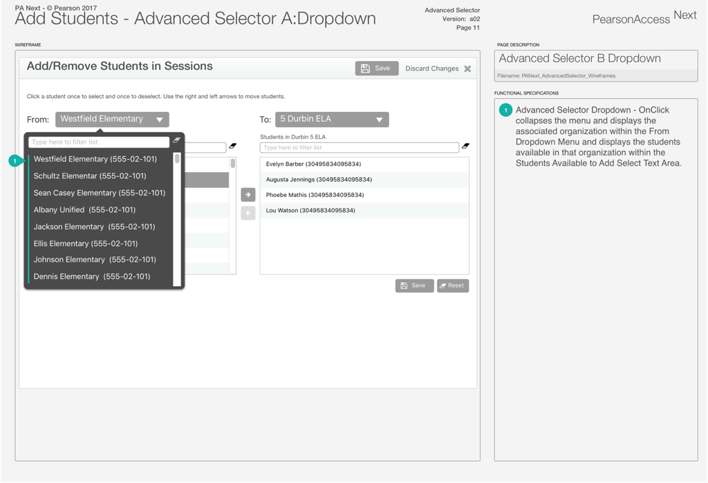
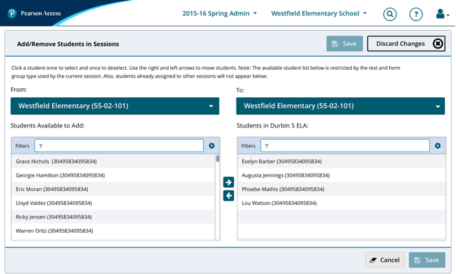
Previously, adding or removing a student to a session was a three-step process. Above, it is redesigned as a single screen using a Dual Listbox, making moving a student between the two lists visible and more understandable than in the old system.
Redesign Highlights
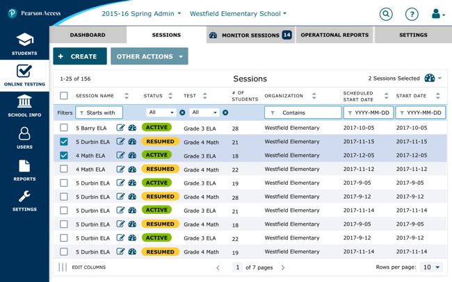
I designed comps based on my wireframes. A sessions tab lists all sessions by default for the majority of users. A row of filters at the top of each data table makes searching easy.
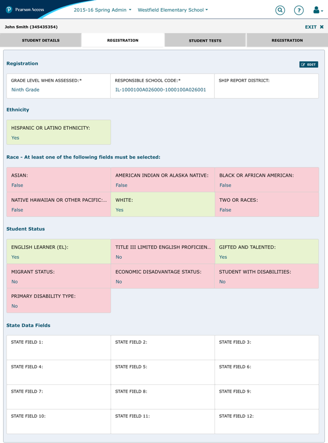
A new student info screen allows user to edit data in-place. When a user taps the edit button, the info fields become input fields. In the read-mode, data fields are styled in a consistent way and binary fields are color-coded red and green for easy scanning.
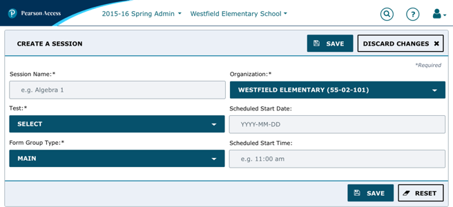
In the old app, creating a session required three screens. All unnecessary fields were removed so that creating a session only requires six fields on a single screen. s
Adding or removing students from a session is done on a single screen instead of three.
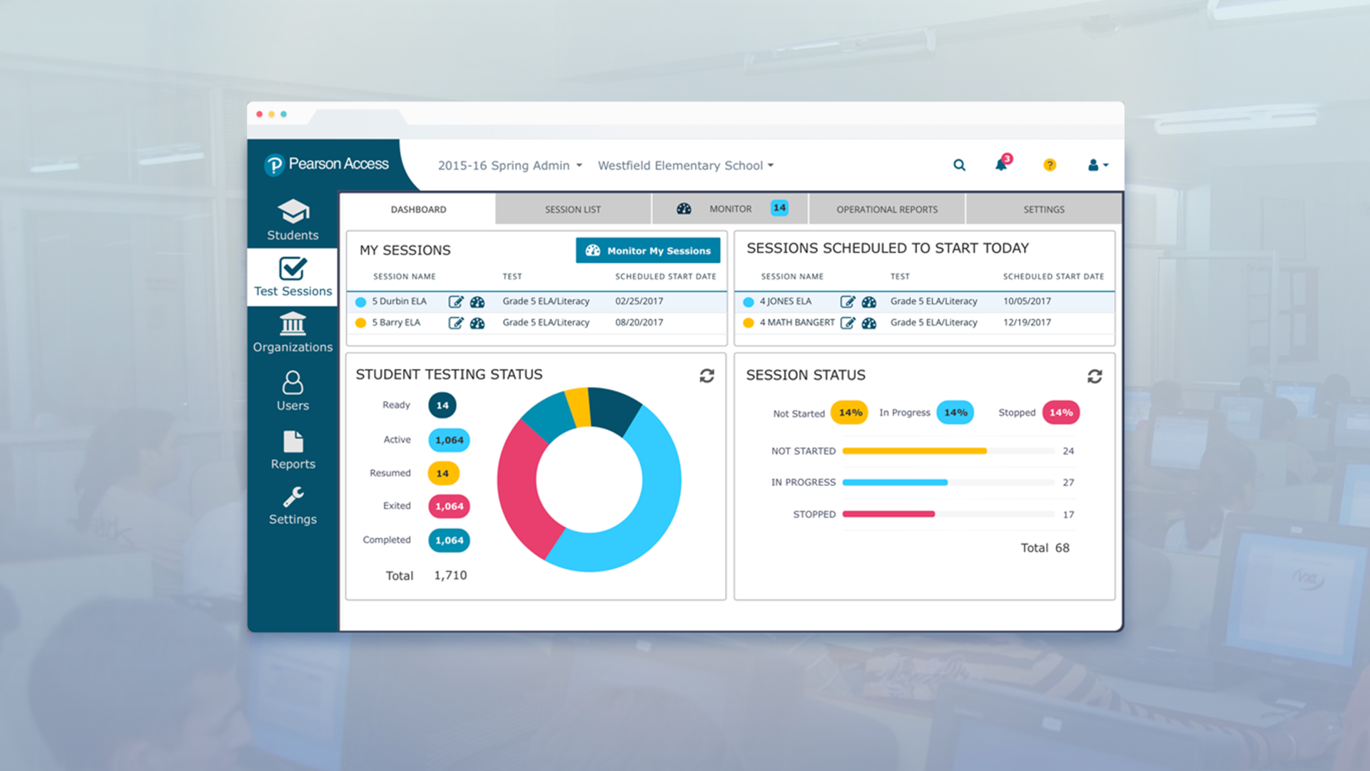
'Students in Session' is now 'Monitor Sessions' Proctors land here upon login with their assigned sessions pre-populated.
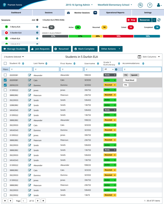
A product tour introduces users to new features and is available to help users if they get stuck in a Help menu that consolidates help info at the top of the page above the fold. The redesigned interface and integrated help should help reduce calls to technical support.
A new look and feel
In addition to usability improvements, the comps incorporate new global corporate colors and fonts while also enhancing accessibility. Status colors needed to match the colors used in previous versions of Pearson Access. Pearson's accessibility team helped me ensure that all elements use colors and fonts that meet Web Content Accessibility Guidelines (WCAG) AAA accessibility standards.
In addition to usability improvements, I designed comps that incorporate new global corporate colors and fonts. Status colors needed to match the colors used in previous versions of Pearson Access and all colors and fonts had to meet AAA+ accessibility standards. I designed multiple breakpoints for Pearson Access because the new website would be a fully-responsive SPA (single page web application) using Angular 2.
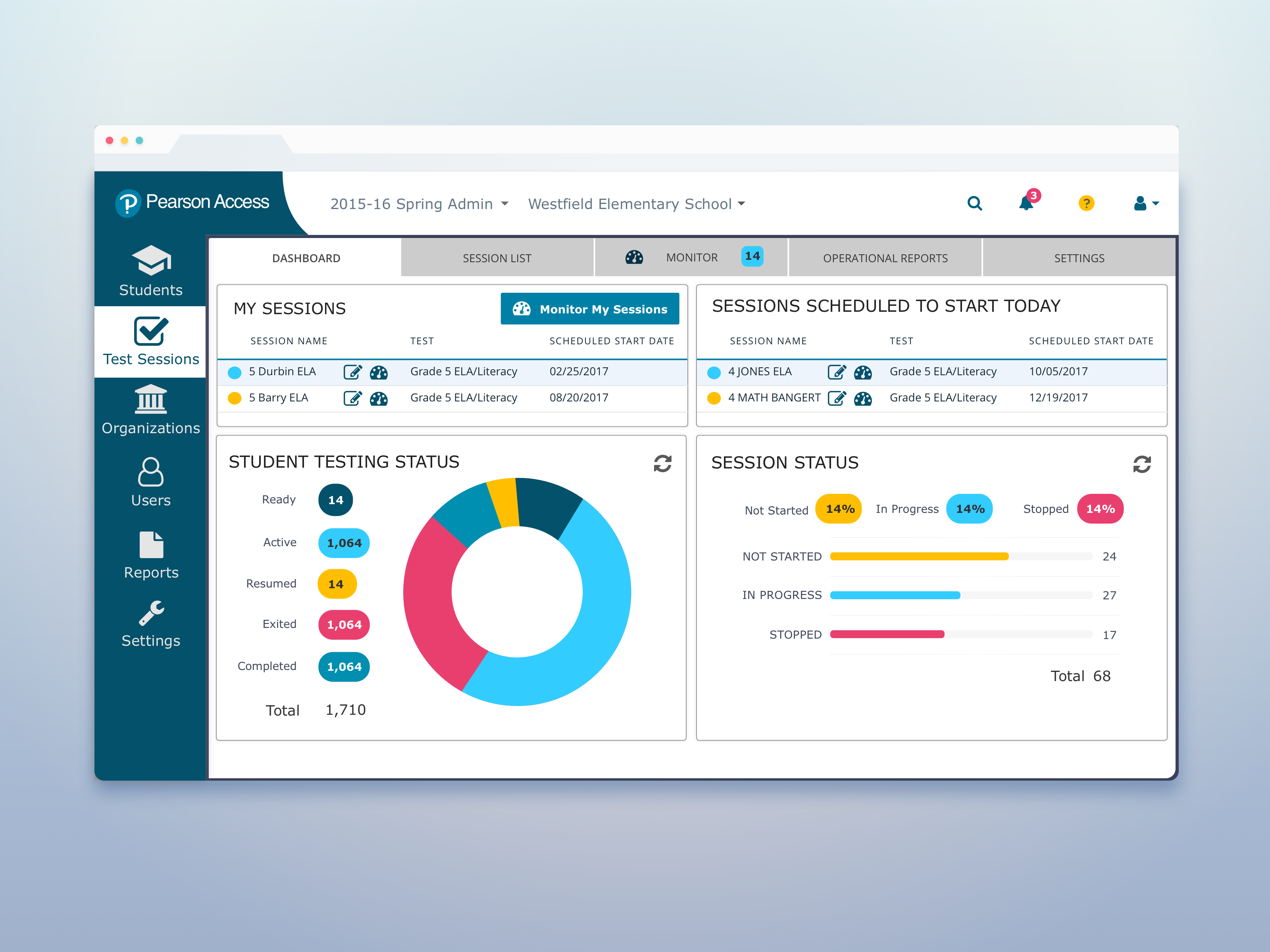
Optimizing the proctor experience was the main goal the redesign, but the project also added a new dashboard for administrators that displays the most important data to those users (and shows off the new colors).
The dashboard doesn't just provide information. Two buttons next to each session shown on the dashboard allow power users to quickly jump to the dashboard of a session that is in trouble. Tapping a portion of the circle graph links power users to a filtered view of the student in sessions screen showing those session that match the selected status.
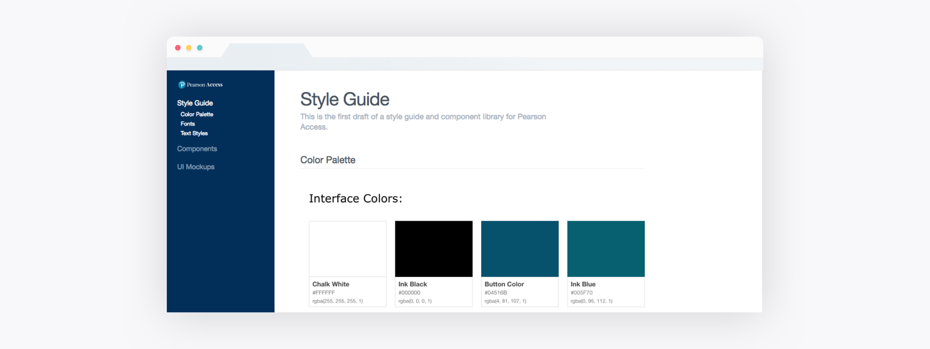
To support implementing and maintaining the new visual design system I created a basic style guide website (above) that contains comps of all screens and comps of each major UI component, the color palette, fonts and text styles.
OUTCOME
Results and what I learned:
- A Design Sprint helped our team develop a minimum viable product and validate it early in the design process.
- I learned a lot about a11y requirements, which go well beyond color contrast and font sizes.
- On this project I lead UX and visual design.
Invision Protoypes:
Monitor Sessions Prototypes: Early Prototype > Final Prototype
Various Wireframes:
Advanced Selector: Wireframes [PDF]
Data Grid: Wireframes [PDF]
Global Elements: Wireframes [PDF].
Search: Wireframes [PDF]
#ui #ux #interaction #web_app #accessibility